

Tailwind Components vs Utilities: Why the Real Debate Is About Cascade Control
The distinction between components and utilities in Tailwind CSS is not a terminology debate - it is an operational rule that determines how cascade priorities and override points work in scalable CSS architectures. Tailwind v4 enforces this boundary through native CSS cascade layers, giving teams a predictable model for managing style conflicts without specificity hacks. Understanding this mechanism is essential for any team maintaining a long-lived codebase where multiple developers commit to a shared design system.
The CSS-Tricks article "Distinguishing Components and Utilities in Tailwind" reignited this discussion, but most teams miss the real point. The author argues that etymologically both terms are interchangeable - "component" means "part of a whole," and "utility" means "useful thing." The meaningful difference is operational: how each category behaves in the cascade and whether one can predictably override the other.
In enterprise codebases, blurred component-utility boundaries lead to specificity wars, unpredictable overrides, and regression-prone stylesheets. This article explains how cascade layers work in Tailwind v4, when to use @layer components vs the @utility directive, and provides a governance framework that keeps stylesheets scalable across teams. Every code example comes from real B2B scenarios - SSO portals, e-commerce catalogs, and admin panels - not textbook abstractions.
What Components and Utilities Actually Mean in Tailwind
A utility in Tailwind is an atomic, composable CSS rule that works with variants and can be safely combined, overridden, or moved between projects. A component is a product-level UI contract that may use CSS classes but is best abstracted in code - React, Vue, or Svelte templates - not in stylesheets. This operational distinction, rather than any semantic argument, is what keeps large codebases maintainable.
The CSS-Tricks article makes a provocative case: both terms are semantically interchangeable. "Component" literally means "part of a whole," and "utility" means "useful thing." By that logic, every utility is a component and every component is a utility. The author pushes this to its conclusion, suggesting the terminology debate yields diminishing returns.
The meaningful difference is operational, not linguistic. In Tailwind, component classes live in @layer components and can be overridden by utility classes from @layer utilities. This cascade layer boundary determines how styles interact in production. When a developer adds rounded-none to an element with a .btn class, the utility wins because it sits in a higher-priority layer. That predictability is the entire point.
For teams working on enterprise products, these working definitions reduce ambiguity in pull requests and architectural decisions:
- Utility: atomic rule, combinable with other utilities, safe to move between projects, works with
hover:,focus:,lg:, and other variants - Component: a product-level UI contract (e.g., "SSO login button with loading and error states," "invoice row with warning and overdue indicators," "admin table header with sticky positioning and column resize")
Why Terminology Matters for Code Reviews
Clear definitions eliminate the recurring debate in pull requests: "Should this be a utility or a component class?" When the team agrees that utilities are atomic and layer-aware while components are product-level abstractions in code, the decision becomes mechanical. If it is atomic and needs variant support, it goes through @utility. If it is a complex UI pattern with multiple states, it becomes a React or Vue component that composes Tailwind classes internally. Teams that invest in a solid web development architecture from the start avoid these debates entirely.
Teams can enforce these rules through linting configurations and architectural decision records. This removes subjective judgment from code reviews and replaces it with verifiable criteria that any developer can apply consistently.
How CSS Cascade Layers Work Under the Hood
CSS cascade layers, defined in the W3C CSS Cascading and Inheritance Level 5 specification, let you control style priority by layer order rather than specificity. Styles in a later-declared layer always override styles in earlier layers, regardless of how complex the selectors are. This mechanism is the foundation of Tailwind v4's predictable override behavior.
The cascade layer model follows five rules that every frontend developer should internalize:
- Layer priority follows declaration order - later layers win over earlier ones
- Within a single layer, normal specificity and source order apply as usual
- Between layers, specificity becomes irrelevant - the layer declared later always takes precedence
- Unlayered styles (CSS written outside any
@layer) override ALL layered styles - For
!importantdeclarations, layer priority inverts - earlier layers gain precedence over later ones
Browser support for cascade layers stands at 96%+ globally, covering Chrome 99+, Firefox 97+, Safari 15.4+, and Edge 99+. This is production-ready for any modern web project, and teams focused on professional SEO services can leverage cascade layers to reduce CSS bloat and improve Core Web Vitals scores.
The Unlayered Trap
Rule 4 is the single most common source of cascade confusion in Tailwind projects. CSS written outside any @layer declaration automatically receives the highest priority and overrides everything inside layers. When a legacy stylesheet is imported after Tailwind's CSS, its unlayered rules silently defeat every Tailwind utility.
This is not a Tailwind bug - it is how the CSS specification works. Unlayered rules override layered rules because the spec treats them as having implicit highest-layer priority. In enterprise projects with legacy CSS from CMS platforms, third-party widgets, or older versions of the application, this trap catches teams repeatedly until they explicitly wrap legacy styles in a cascade layer.
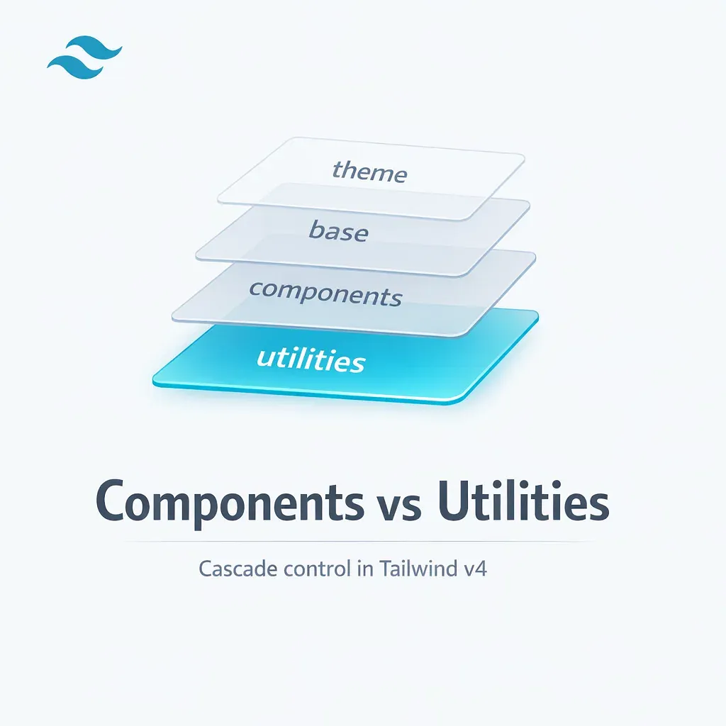
Tailwind v4 Layer Architecture
Tailwind v4 declares four cascade layers in a specific order - @layer theme, base, components, utilities - making utility overrides predictable without specificity hacks or !important flags. This architecture, combined with the new Oxide engine built in Rust that delivers 5x faster full builds and 100x faster incremental builds, represents a fundamental shift toward CSS-first configuration.
Each layer serves a distinct purpose in the cascade hierarchy:
theme: design tokens as CSS variables, defined through the@themedirective - replacestailwind.config.jsfor token managementbase: normalization, typography, and element-level styles that apply globallycomponents: component classes like.btnand.card, plus third-party widget overridesutilities: atomic utility classes - the highest priority among all Tailwind layers
Because utilities is declared last, any utility class automatically overrides any component class. A rounded-none utility will always beat a .btn that includes rounded-md via @apply, as long as both are in their correct layers. This eliminates the specificity arms race that plagues traditional CSS architectures.
@utility vs @layer utilities
Tailwind v4 introduces the @utility directive as the official way to register custom utilities. Unlike wrapping rules in @layer utilities { ... }, the @utility directive automatically enables variant support - meaning your custom utility works with hover:, focus:, lg:, and every other Tailwind variant out of the box.
For new custom utilities in v4, always prefer @utility over raw @layer utilities blocks. The Tailwind documentation on functions and directives explicitly recommends this approach because it integrates with the full variant system and keeps custom utilities consistent with built-in ones.
4 Cascade Problems That Break Enterprise Projects
Most Tailwind cascade failures in large codebases trace back to four root causes: unlayered legacy CSS, @apply overuse, plugins registering styles in wrong layers, and !important abuse. Recognizing these patterns early saves teams weeks of debugging and prevents costly regressions in production.
Problem 1: Legacy CSS Outside Layers
When existing CSS from a CMS, third-party library, or earlier project version is imported without being wrapped in a cascade layer, it automatically receives highest priority. Developers see the symptom - rounded-none or p-4 "doesn't work" on a component - but the cause is invisible without understanding cascade layer mechanics.
The fix is straightforward: wrap legacy CSS in @layer components or a dedicated layer with an explicit priority position. This places the legacy styles within the cascade hierarchy where Tailwind utilities can override them as expected. For large legacy codebases, this migration can happen incrementally, one file at a time.
Problem 2: @apply Creates a Mini-Bootstrap
Teams that use @apply extensively often end up with dozens of .btn-primary, .btn-secondary, .btn-outline-danger variants - essentially rebuilding Bootstrap inside Tailwind. The symptom is 40+ button variants defined as CSS classes, with nobody certain where to make changes without breaking something else.
Tailwind's own documentation warns against this pattern. The recommended approach is to abstract repeated class combinations into code components - a React <Button> component or a Vue <BaseButton> - rather than CSS classes. Reserve @apply for third-party integration surfaces where you must override styles from external widgets like datepickers, WYSIWYG editors, or CMS embeds.
Problem 3: Plugins Adding Styles to Wrong Layers
In the Tailwind v3 plugin API, addComponents() and addUtilities() place styles in their respective layers. During the v4 transition, a documented bug caused addComponents() to add styles to the utilities layer instead of components, breaking cascade expectations for any project using affected plugins.
For enterprise projects, audit every plugin's output to verify styles land in the correct layer. Better yet, prefer CSS-first mechanisms - @utility, @theme, @custom-variant - over JavaScript plugin APIs. This reduces "magical" behavior and makes cascade behavior visible directly in CSS files. A thorough web design process should include cascade layer auditing as a standard pre-launch step.
Problem 4: !important as Universal Hammer
Reaching for !important to resolve cascade conflicts is a natural instinct, but in a cascade layer architecture, it backfires. The CSS specification inverts layer priority for !important declarations - earlier layers gain precedence over later ones. This means an !important rule in @layer base beats an !important rule in @layer utilities, which is the opposite of normal cascade behavior.
Tailwind v4 changed the important modifier syntax from the prefix !bg-red-500 to the postfix bg-red-500!. Use this sparingly and only for genuine edge cases where layer architecture alone cannot resolve the conflict. In most enterprise codebases, proper layer organization eliminates the need for !important entirely.
Enterprise Strategy: Utilities Override Components
For B2B and enterprise projects, the recommended cascade strategy is straightforward: component classes in @layer components, custom utilities via @utility, and zero unlayered CSS without an explicit architectural decision. The Tailwind documentation confirms this approach: "Use the components layer for classes you'd still like to be able to override with utility classes."
This strategy maps to three placement rules that every team member should follow:
@layer base: normalization, typography, element-level styles@layer components: component classes, third-party overrides, legacy CSS migration@utility: custom atomic rules with full variant support
When Component CSS Classes Are Justified
Component CSS classes earn their place in three specific scenarios. First, third-party widget integration - when datepickers, WYSIWYG editors, or CMS embeds need style overrides that cannot be applied through utility classes alone. Second, complex selectors and pseudo-elements that are not expressible as single utilities. Third, legacy migration where existing CSS is gradually wrapped into layers without rewriting everything at once.
Outside these scenarios, UI reuse belongs in code components. A React <Card> component that composes Tailwind classes internally is more maintainable than a .card CSS class with 15 @apply rules. The code component approach provides TypeScript type safety, props-based variants, and clear ownership in the component tree.
Alternative Strategy: Custom CSS Above Utilities
Some teams adopt an alternative approach where custom CSS sits above Tailwind utilities in the cascade - either as unlayered styles or in a dedicated top-priority layer. This works because unlayered rules override layered rules by specification. However, it breaks the fundamental expectation that "a utility can always override a component."
This strategy requires a mature team with documented architectural decisions and a high tolerance for onboarding complexity. In our experience with enterprise projects across the US and Germany, the standard "utilities override components" approach produces fewer regressions and lower maintenance costs over the lifetime of a product. Pairing this architectural discipline with a comprehensive digital marketing strategy ensures that performance gains translate directly into measurable business outcomes.
Code Examples for Real Enterprise Scenarios
Production Tailwind patterns for SSO portals, e-commerce catalogs, and admin panels look different from tutorial examples. These patterns reflect what teams actually ship in B2B projects where predictability matters more than cleverness, and where multiple engineers commit to the same design system daily.
Corporate Portal: SSO Button with Local Overrides
An SSO authentication button needs a base design that is consistent across the portal, but individual pages may require local adjustments - a different border radius for a partner-branded login, extra padding for a touchscreen kiosk view. Design tokens defined via @theme feed brand colors as CSS variables.
@import "tailwindcss";

@theme {
  --color-brand-600: oklch(0.55 0.16 250);
  --color-brand-700: oklch(0.48 0.16 250);
}

@layer components {
  .btn {
    @apply inline-flex items-center justify-center gap-2
           rounded-md px-4 py-2 text-sm font-medium;
  }

  .btn-sso {
    @apply btn border border-slate-200 bg-white text-slate-900;
  }

  .btn-sso--primary {
    @apply btn bg- text-white;
  }
}
In the template, local overrides use utility classes that predictably win over the component layer:
<button class="btn-sso--primary rounded-none px-6">
  Sign in with SSO
</button>
This works because .btn-sso--primary lives in @layer components, while rounded-none and px-6 are utilities in the higher-priority @layer utilities. No !important, no specificity tricks - just cascade layer order doing its job.
E-commerce Catalog: Product Card with Legacy CSS
When migrating an e-commerce catalog that uses legacy CMS styles, the challenge is often reversed: you need to prevent legacy CSS from breaking Tailwind utilities rather than the other way around.
@layer components {
  .product-card {
    @apply rounded-lg border border-slate-200 bg-white p-4;
  }

  /* Legacy CMS overrides wrapped in the same layer */
  .cms-product-card .title {
    @apply text-base font-semibold;
  }
}
If legacy styles arrive outside any @layer, they will override all Tailwind layers by specification. The migration strategy involves either wrapping legacy CSS in @layer components or documenting the import order as an explicit architectural decision that the team reviews quarterly.
Custom Utility: Enterprise Focus Ring
Accessibility focus indicators should be consistent across every interactive element in a product. The @utility directive creates a single source of truth that integrates with all Tailwind variants:
@utility focus-ring {
  outline: 2px solid color-mix(
    in oklab,
    var(--color-brand-600) 70%,
    transparent
  );
  outline-offset: 2px;
}
In any component template:
<button class="btn focus-visible:focus-ring">Save changes</button>
Because @utility automatically registers in the utilities layer and enables variants, focus-visible:focus-ring works identically to built-in Tailwind utilities. This approach ensures that every interactive element uses the same focus style - important for accessibility audits and WCAG compliance in regulated industries.
Governance: Lint Rules and Code Review Checklist
Cascade discipline at scale requires tooling enforcement, not just documentation. A governance framework combines ESLint and Stylelint rules, a code review checklist, and typed component variant libraries to make cascade violations visible before they reach production.
Linting Configuration
Two categories of linting rules prevent cascade problems at the source:
- ESLint plugins for Tailwind: enforce class ordering, detect conflicting utilities (e.g.,
p-4andp-6on the same element), and warn about deprecated patterns - Stylelint rules: detect CSS written outside
@layerblocks, flag!importantusage without an override comment, and enforce the layer naming convention
Code Review Checklist
Pull requests that modify CSS or Tailwind classes should pass through these verification points:
- No CSS outside
@layerwithout a documented architectural decision - No
@applyfor UI reuse that should be a code component - New custom utilities use
@utility, not raw@layer utilitiesblocks - Third-party style overrides are placed in
@layer components - No
!importantwithout a linked issue explaining why layer architecture is insufficient
CVA and Typed Component Variants
Class Variance Authority (CVA) and tailwind-variants replace string-based class patterns with typed, composable variant definitions. Instead of maintaining .btn-primary, .btn-secondary, and .btn-outline as CSS classes, teams define variants in TypeScript with autocomplete and compile-time validation.
This eliminates an entire class of bugs where a developer misspells a variant name or passes an invalid combination. For enterprise design systems shared across a monorepo - where multiple products consume the same UI package - typed variants prevent silent regressions that only surface in visual testing. Industries like real estate website development in USA benefit particularly from this approach, as multi-property portals often share component libraries across dozens of branded microsites.
Design Tokens and Monorepo Strategy
The @theme directive centralizes design tokens as CSS variables. In a monorepo architecture, a shared UI package exports tokens (colors, spacing, typography scales) alongside code components. Each product imports the package and overrides tokens as needed through the cascade - a pattern that scales from two applications to twenty without duplication.
Migration from legacy CSS to layered components happens in phases: first wrap legacy styles in @layer components, then incrementally replace @apply-heavy classes with code components, and finally consolidate tokens into @theme. Each phase is independently deployable and testable.
Debugging Cascade Layers in DevTools
Chrome and Edge DevTools include a dedicated Layers view that visualizes cascade layer priorities directly in the Styles panel. This makes diagnosing override conflicts straightforward - you can see exactly which layer a winning rule belongs to and why a utility is or is not overriding a component.
The debugging workflow for cascade layer conflicts follows four steps:
- Inspect the element with unexpected styles and open the Styles panel
- Toggle the Layers view to see the full layer hierarchy with priorities listed from highest to lowest
- Check for unlayered styles - if a utility is not winning, look for rules outside any
@layerthat sit above all layers - Verify
!importantbehavior - if important declarations are involved, remember that layer priority inverts for them
Each CSS rule in the Styles panel is annotated with its @layer name next to the selector, so you can immediately identify whether a rule is in components, utilities, or unlayered. As GEO and AI SEO become more important, clean cascade architecture also helps crawlers parse CSS efficiently and improves rendering performance metrics that influence search visibility.
There is a known Chrome DevTools bug where the cascade override visualization shows incorrect information when @layer is combined with !important. The DevTools may display a rule as overridden when it actually wins, or vice versa. If your debugging results contradict the spec, test in Firefox DevTools as a cross-reference - Firefox's cascade layer visualization handles this edge case more accurately. The DevTools Tips guide on cascade layer debugging provides additional techniques for complex scenarios.
Conclusion
The component vs utility distinction in Tailwind is an operational tool for cascade management, not a semantic debate. Cascade layers - the mechanism that Tailwind v4 uses natively - make style priority predictable regardless of selector complexity. Getting this architecture right eliminates specificity wars and makes stylesheets scale with the team rather than against it.
- Components in
@layer components, custom utilities via@utility- this single rule prevents most cascade conflicts in production - Unlayered CSS overrides everything - audit legacy stylesheets and wrap them in explicit layers before they silently defeat your utilities
- Abstract UI reuse in code components (React, Vue, Svelte), not CSS classes with
@apply- code components provide type safety, props-based variants, and clear ownership - Enforce layer discipline through tooling - linting rules, code review checklists, and CVA prevent cascade violations before they reach production
- Tailwind v4 cascade layers eliminate specificity wars for teams that follow the architecture - and the Oxide engine makes builds fast enough that CSS-first configuration costs nothing in developer experience
If your team is scaling a frontend codebase and struggling with CSS override predictability, a structured approach to cascade layers is the highest-leverage improvement you can make. For corporate website development projects where long-term maintainability matters as much as launch speed, this architecture pays for itself within the first quarter of active development.
What is the difference between components and utilities in Tailwind CSS?
The difference is operational, not semantic. Utilities are atomic, composable CSS rules that live in the @layer utilities and work with variants like hover: and focus:. Components are product-level UI contracts that live in @layer components and can be overridden by utilities through the cascade layer hierarchy. This layer boundary ensures predictable style priorities in production.
How do CSS cascade layers work in Tailwind v4?
Tailwind v4 declares four cascade layers in order: theme, base, components, and utilities. Later-declared layers override earlier ones regardless of selector specificity. Because utilities is declared last, any utility class automatically overrides any component class. Unlayered styles outside any @layer override all layered styles, which is a common source of cascade confusion in projects with legacy CSS.
When should I use @utility instead of @layer utilities in Tailwind v4?
Always prefer @utility for new custom utilities in Tailwind v4. Unlike raw @layer utilities blocks, the @utility directive automatically enables variant support, meaning your custom utility works with hover:, focus:, lg:, and every other Tailwind variant out of the box. The Tailwind documentation explicitly recommends this approach because it integrates with the full variant system and keeps custom utilities consistent with built-in ones.
Why do Tailwind utility classes sometimes fail to override component styles?
The most common cause is unlayered CSS. When legacy stylesheets or third-party CSS is imported without being wrapped in a @layer declaration, it receives the highest priority and overrides all layered styles, including Tailwind utilities. The fix is to wrap legacy CSS in @layer components or a dedicated cascade layer so that Tailwind utilities can override it as expected through the cascade hierarchy.
What is the recommended approach for reusing Tailwind styles across components?
Abstract repeated class combinations into code components like React, Vue, or Svelte templates rather than CSS classes with @apply. A React Button component that composes Tailwind classes internally provides TypeScript type safety, props-based variants, and clear ownership. Reserve @apply and component CSS classes for three scenarios: third-party widget integration, complex selectors and pseudo-elements, and legacy CSS migration.
How do you debug CSS cascade layer conflicts in browser DevTools?
Chrome and Edge DevTools include a Layers view in the Styles panel that shows which cascade layer each rule belongs to. Inspect the element, toggle the Layers view, check for unlayered styles that override everything, and verify !important behavior where layer priority inverts. Note that there is a known Chrome DevTools bug with @layer combined with !important - use Firefox DevTools as a cross-reference if results seem inconsistent.
